Wednesday, May 5, 2010

LAST ASSIGNMENT: PHOTO COLLAGES AND MIX MEDIA


In this project, we are to use different photographs taken with panorama technique to create a whole or a part of the composition. From there, use paint to finish the project. The goal is to create visual hiccups to the viewers. We are not going to try to imitate the photographs or hide the fact that photos are glued underneath or used as part of the composition.

Before working on this project, we got a chance to see the work of Luke Buchanan and hear him talk about the process. It amazed me how he can use the colors and the paint so effectively with photographs and be able to tell an interesting story.

“The painting as a sum of all parts becomes both literal and symbolic”
—Luke Buchanan

The process of this project follows these steps:
  1. Take photos of the location/object using panorama style. I took more than 100 photos to make sure that I have every details needed for my project. By the end, I only used 6 of them. The extra photos did not go to waste because I can use them for different approach to the same subject if I want to paint again.
  2. Glue down the photos using gel medium. Since I used a very thin photo paper, they end up being really wrinkle and easy to be ripped. I was worried a little that I almost teared them down to re-glue everything.
  3. Paint in really thin layers to see different layers of colors. I was really happy before I started because painting thinly IS my strength. I always like the water color effect and unconsciously create that effect using any kind of material. The truth is never pretty. Oil and I are not best friends!
  4. Finish up!

Glued photos. The wrinkles actually create really nice effects of the rusted and woody look of the house. It brings out the old and abandon feeling for the place. We’ve got to love lucky accidents!


I accidentally painted on the photos but my professor caught it! She told me to wipe everything off so that I can take advantage of the photos! I HATE wiping off things. Just like in design, I avoid using UNDO and avoid erasing in drawing. I’m glad I wiped the paint off though because now I don’t have to worry about how to re-create the whole scene.


More layers of paint. I like to plan ahead my painting by either sketching or playing on the computer. In this project, I lay the photographs the way I liked in photoshop, measured the dimension for the support and print of a few copies of this composition. From there, I used color pencil to play with different color palettes until I felt happy. In this case, I kept the color true to the photographs. 


By the end of that class work time, I was able to block in the whole painting. I was even able to finish the right side of the painting that I was really satisfied. It was my most favorite spot on this painting.


I had only an hour to work on in class that day because we were about to go to the Art Museum as a whole class. After discussing with my professor, I learned that I could play with the light temperature between the inside and outside, how to play with light to dark to pull the perspective. I blocked some more paint for the ceiling and made a wide range of shades for the floor. I also blocked the sky so that I can have a better visual. Still undecided of what to create for the ceiling and how to connect the inside with outside without making the painting too weird! Pencil color is soo much easier than painting oil! Oh and by the way, that photo is of my painting and the head of my professor.


Here is the semi-final version! Please excuse the glare from the sun on the really dark corners. I worked on the ceiling and the sky more. I also refined the shadow of the handle. Trees are touched up. I was rushing because I had about an hour to turn in everything for this class and other classes. Somehow I pulled it off. Magic does happen I guess!


Here are some of the closed up shots. If you look really closely, you will see where the photos end and where the painting starts.


I did a few last touch up on the ground so that there is no more bright spots and make the tree to the far left more airy looking! I am still not too happy about that tree...more touch up during the summer? Thoughts?

This painting breaks all of my records in terms of timing. I had the idea right away, the photos were ready and the painting were done in less than 3 class sessions (about 8-9 hours). A lot of students did not choose the architecture topics because they did not want to “imitate” Luke Buchanan’s style. I want to see how different artists can interpret the same subject matter using the same techniques. Of course, I am not as experienced as Luke but I am sure with more practice, I will get better. I really enjoyed this and I think it is the project that I am able to use all I have learned in class:
  • Directional strokes
  • Color temperature
  • Painting light
  • The use of different brush
  • Mixing colors 
  • Using different materials instead of only paint
  • Wipe off my paint!!!
  • Scrape paint off!!!!
It is a nice way to end my painting class? And my college career! I am graduating in 3 days you all!


Friday, April 30, 2010

RESEARCH ASSIGNMENT: SALVADOR DALI AND SURREALISM


Learning about the history and the style of well-known painters is a great way to gain a foundation. By reading about art history, our brain will know what style we can mix up. Our eyes get trained by looking at great paintings. From there, our hands know how to paint better. My topic for the research project is Salvador Dali and the style that he spent most of his life painting: surrealism.

This research has two parts. Part 1 is a traditional research where I have to find information about Dali and Surrealism, write a report and make a presentation. Pretty easy!

Part 2 is not so easy. We have to paint a still life using the style that the great artist we just research on. Me, no surrealist yet I have to paint a surrealistic still life. I am totally lost!

I started out by sketching the still life at different angles and different crops. I used my pencil and note pad the same way as I use my camera in terms of finding a better composition. Once I have a pretty good composition, I used the projector to project the little sketch onto a 18x24 canvas.


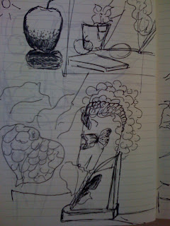
The objects and my sketchbook


The final version is the combination of these two


Roughly sketched on the canvas


I used colored oil pastel to outline again. Notice the blank behind the still life? I have to make up something for that part!


A window, a mirror? What???? Undecided for now!


I start blocking in the color! I have made my mind that a window looks pretty good behind everything.


The sky behind the plant really is kicking my b*tt. Since nothing is really “real” and I don’t have any reference to the cloud, I keep messing up! Note the paint chip at the right corner of my canvas. That is the color reference!


Since Dali used a lot of cloud image and butterflies as well as surreal shadow in his paintings, I also want to try that. I make the horse’s hair cloud and his eye become a butterfly. The shadow of a leaf becomes the horse’s vein (or whatever you want to call it)

This project, I have to say, is my most challenging project I have ever had for painting. I did not know what I want to paint. I did not do any color sketches to plan everything. It was a disaster at first! I will mix color on my palette and mix again right on my canvas. There was time that I got so frustrated because I chose such a different style than mine to work on. I am glad I gave it a try though. Now I know that surrealism is NOT my friend at all. 

P.S: Check back soon, I will post more photos of this project when the paint is dry. That way the color is going to be more accurate.


Tuesday, April 6, 2010

PAINTING ASSIGNMENT II: WOMEN’S IMAGE


“For most of history, Anonymous was a woman.”Virginia Wolf


Phew, I finally can really sit down and blog about my third painting after a long week of being unproductive, running errands (not for my own business) and all. This project follows the “imitation” project that we did a few weeks ago (I will try to blog about it when I put the photos in the computer). 


In this one, we used panel as the support, a ground was not a requirement. The initial ideas of the whole piece was based on a quote we found. From there, we were free to do whatever we wanted to express that quote. The most important requirement was that it had to be painted somehow.


I came across Virginia Wolf’s quote and really liked it. As a student in a women institution, the role of the women was mentioned in almost every single class I took. I am really aware of how the women was in the old time especially when their role was not recognized in the society (at least, not as significant). 


Anyone who knows me will not be surprised when I started looking for images of flowers to represent the women. To me, flowers are so beautiful and their meanings can be applied to paintings. I especially am in love with the renaissance which explains why a lot of the basic human drawing and the composition in this project were influenced by that time period.


At first, I was struggled with the idea of how to incorporate this quote into a painting. Yes, I love the quote. Yes, I love being a women and will fight for women’s right. But that was not enough for the idea to come up. I knew I wanted a light and airy feeling. I knew I wanted to use flowers’s symbols. Ferns and honeysuckle are the two symbols that I knew would fit into this project perfectly.


Ferns: Sincerity, magic, fascination, confidence, shelter
Honeysuckle: Beauty, fidelit
The birth of VenusBotticelli


I started sketching all the images of ferns and honeysuckle that I found. I also found one illustration of honeysuckle that I might be able to glue on the panel as a guide. This piece can totally be a mixed media! While sketching the fern, I realized that the woman’s backbone looks like the stems of the fern: very gentle but very stable at the same time. After discussing with my professor about the idea of putting a woman’s back in the picture, we decided that we should give an Identity 
to my woman image instead of making her “anonymous” again. To be honest, I was a little scared because I don’t know which image, emotion I should bring to her face. I myself was not trained for drawing human nor painting human. I came back to my history book and looked at different paintings during the Renaissance. The Birth of Venus was the one that had the airy and light feeling that I would like to bring into my painting. Using it as a guide, I was able to come up with a composition that I was happy with after a lot of sketches of different elements: the body, the ferns, the honeysuckle, and the text. Now, all I have to do was to blow the sketch up with a projector and re-sketch on the panel. 

Painting a huge panel without a lot of experience was a troublesome. As soon as I laid the flowers down, I realized that I should have done something to the background...put down some colors somehow. Well, the original plan was to leave the panel plain and rustic. It didn’t work that way!!!


I started laying on colors. While working on arranging the composition on the computer, I did try to put some color background so that all the components could bond together. Now that I worked on the panel, I tried to imagine the color I used and tried to remix it with my palette. NOT EASY! I got it to work at the end. With a cloth, I smudge the background so that I could have a light but rustic looking background.


With directional strokes, I added some to create the flows, making as if the figure was being elevated. I really liked the halo effect in the early christian paintings so I tried to create that too. 


As you can see in the previous photo, I did not paint around or on the flower illustration which was glued down with the gel medium. This made the painting very unfinished and at its very first stage. Later on, I came back and worked around the flowers to make the background seamless. I also repainted a lot of the flowers, added in the little details so that they could be alive.


Before


After

I worked really fast from glueing down the flowers stage until putting down the fern. It took me only 3 hours to make all that happened. There was the risk of not finishing the project on time and waiting for the paint to dry but I was able to get as much feed back and just put all my ideas into one place at a time. My brain and my arms were tired by the time I got to paint the ferns. I painted everything without looking back at my sketches because I thought I knew this so well and I knew what I wanted very clearly. Reality proofed me wrong. In the “before” photo, you can tell that my fern was heavy, looked like it was just slapped on with paint and lacked of the airy feeling that I was trying to achieve. I knew something was wrong and was confused of how to achieve the small stroke drawing. After consulting with my professor, I learned that I was able to use oil pastel to mix with oil paint (duh, right?). I scraped off the heavy paint I just applied and outlined the fern with pastel (this time, I did use my sketch as a guide!). By the end of the fern, I was able to use only oil paint to paint the small leaves of the ferns. I was happy as a kid getting a treat!

Since I worked under a deadline (I started working on the panel at 8 in the morning and finished at 12. The whole project was due at 12:30!!!!!!!!), I was not able to draw the text on as I planned. My marker requires a dry surface in order to show. I tried to use the cloth to wipe and smudge as much oil away as possible but I still could not put down the last words of the quote which means I would have to come back and reapply when the paint is more drier.


The biggest lesson in the project that I should always remind myself is to start working as soon as I got the sketch done. Yes, I am a perfect procrastinator and I get things done but I will not have time to make a perfect piece by the due date! Also, I am now so much more confident with working with different materials. Oh, and very comfortable with scraping down the paint; I used to hate it!


Tuesday, February 9, 2010

VISIT ANNA PODRIS AT ART SPACE


Check back soon for my post about our awesome trip to Art Space!


5 OBJECTS STILL LIFE BLACK AND WHITE PAINTING


Ground: Gesso with gray paint
Support: Watercolor paper
Solvent: Turpenoild (sp?)
Palette: Black and White

After playing with the box painting, we started working on a "real" painting project which trains us the skills of drawing and painting objects with their relationship with the surrounding environment. In this project, we were given a limited palette of black, white and the variations of grey. It has been a while since I had my drawing class so it took me a little time to catch my breath and start sketching with my brush. At one point, I could hear my heart beats when I started blocking the paint in following the values. I guess it really has been a long time since I painted!!!


Blocking in the paint with values ranging from light to dark


With the help of my professor, I was able to get the a wide range of values for the objects. However, it was a challenge figuring out how to make the darkest object 3-D because it was so dark that I could not see its values with my eyes.


I finally got to the point that I was happy with the ranges of values for the objects. Now comes the surrounding areas for the object. I knew I wanted to make it a dark background to pop the lighter values and transform how I saw the light onto paper. I know that the background would have a range of values just like the objects but I was so into making it dark that I did not realize how dark it got! When I evaluated this version, I found that the shadows were not working right. The shadow of the darkest object did not lie down on the ground and there should not be a light source coming in front of the darkest object.


As you can see this version compared to the pervious one, now there is a light source hitting the dark background. Once I was able to understand how the light bounce, it was so much easier for me to fix the flat black shape. I also put more white onto the white ares on the 5 objects to see if that can create a stronger affect. I also revisited the shadow on the square object to make it more realistic.

This type of object study is probably one of my most favorite projects in any of my fine art class. I relate my skills from photography on how to see objects in its values instead of colors. Black and White give me the privilege of not being distracted by colors and brings out the simple beauty of the shapes. In this project, I learned how to do directional strokes which helps defining the light directions. I also learned how to use my brushes the right way without being afraid that I will destroy the bristles of the brush when I paint with pressure. Coming from painting water color, this project pushes me out of my comfort zone. I was forced to use thicker paint to reduce the chance of liquid cracks on the paper and use tubernoided rags as an eraser which water color will not be able to be as forgiving.